12 secto send.
Reviews that
actually get posted.
More 5-star reviews. Fewer angry surprises.
Reviewer Loop turns the awkward "hey, mind leaving a review?" moment into a 12-second text — and quietly steers unhappy customers to you instead of to Google.
The text message itself.
Sarah's first impression of Review Loop isn't the gate page — it's this SMS. The conversion rate of the entire product hinges on whether she taps the link. That depends on three things: identifying the business clearly, sounding like a human wrote it, and making the ask concrete.
"Hi Sarah!" — uses her name (1.4× tap rate vs no name). "Mike from GreenLawn TX" — names the human, names the business. The hook line is casual but specific to the work. The link is short and branded.
Owner-customizable in onboarding, with three pre-written templates and a "let AI write one for me" option. Industry-specific defaults (lawn care vs catering vs salon) keep the templates from feeling generic.
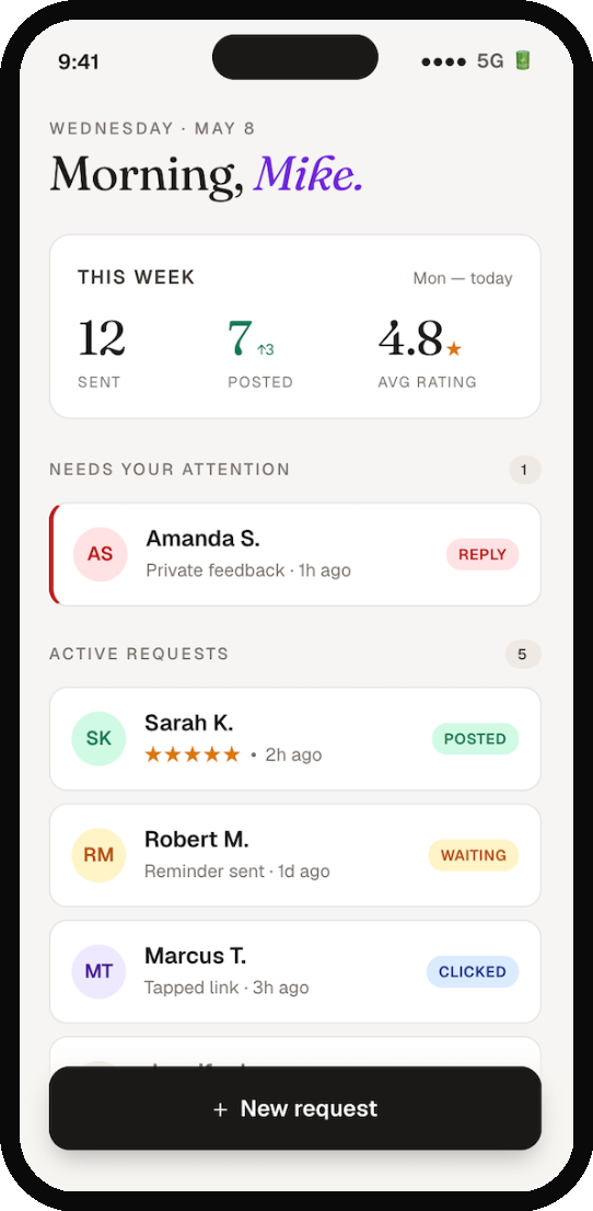
- 01The home screen earns its real estate.
Most reputation tools dump owners into a generic dashboard with twelve metrics nobody reads. Mike opens this app maybe three times a day for thirty seconds. The screen has to answer one question on arrival: is anything on fire, and is the system working? The "needs your attention" section is always at the top. If it's empty, it just doesn't render — Mike never sees it unless he needs to. Below that, a flat list of recent requests with status pills. The stats card is small, deliberately. It's the score, not the game. The + New Request button is locked to the bottom of the screen, thumb-reach, ink-black to feel grounded and confident. This is the one button that has to be one-tap accessible — every other interaction can take a tap or two more.
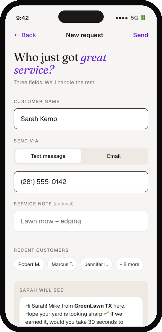
- 02Fast — because Mike is in a truck.
The most common context for this screen is Mike standing on a customer's lawn, sweat on his forehead, the customer just walked back inside. He has 30 seconds before he's onto the next job. If this form has more than three fields, he won't use it. Three fields: name, contact (phone or email), and an optional service note. The recently-used customer chips below let returning customers go in two taps total. The message preview shows him exactly what Sarah will read — no surprises, no second-guessing. The Send button stays inactive until the form is valid. The visual cue (deep purple when ready) creates momentum: fill, see it light up, send.
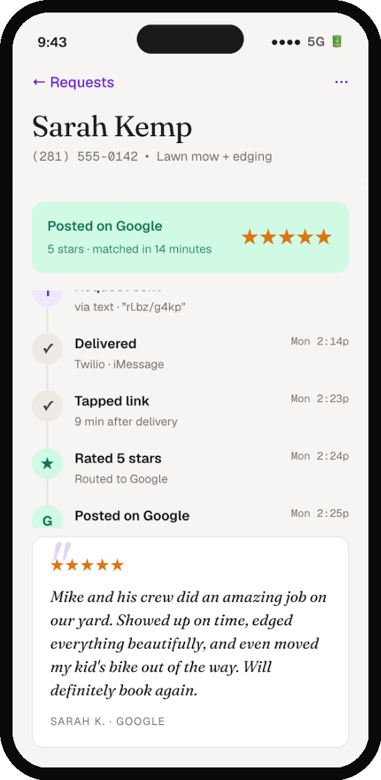
- 03Every request gets a story.
This is where Reviewer Loop's wedge becomes visible. Most tools tell you "you sent 12 review requests this week." This screen tells you: here is what happened to Sarah's, minute by minute. The timeline isn't decoration — it's the proof of work. When Mike's wife asks "did that review tool we paid for actually do anything?" he can show her this. The review quote at the bottom uses Fraunces in italic to feel like editorial pull-quote. Sarah's words get the design respect they earned by being five stars.
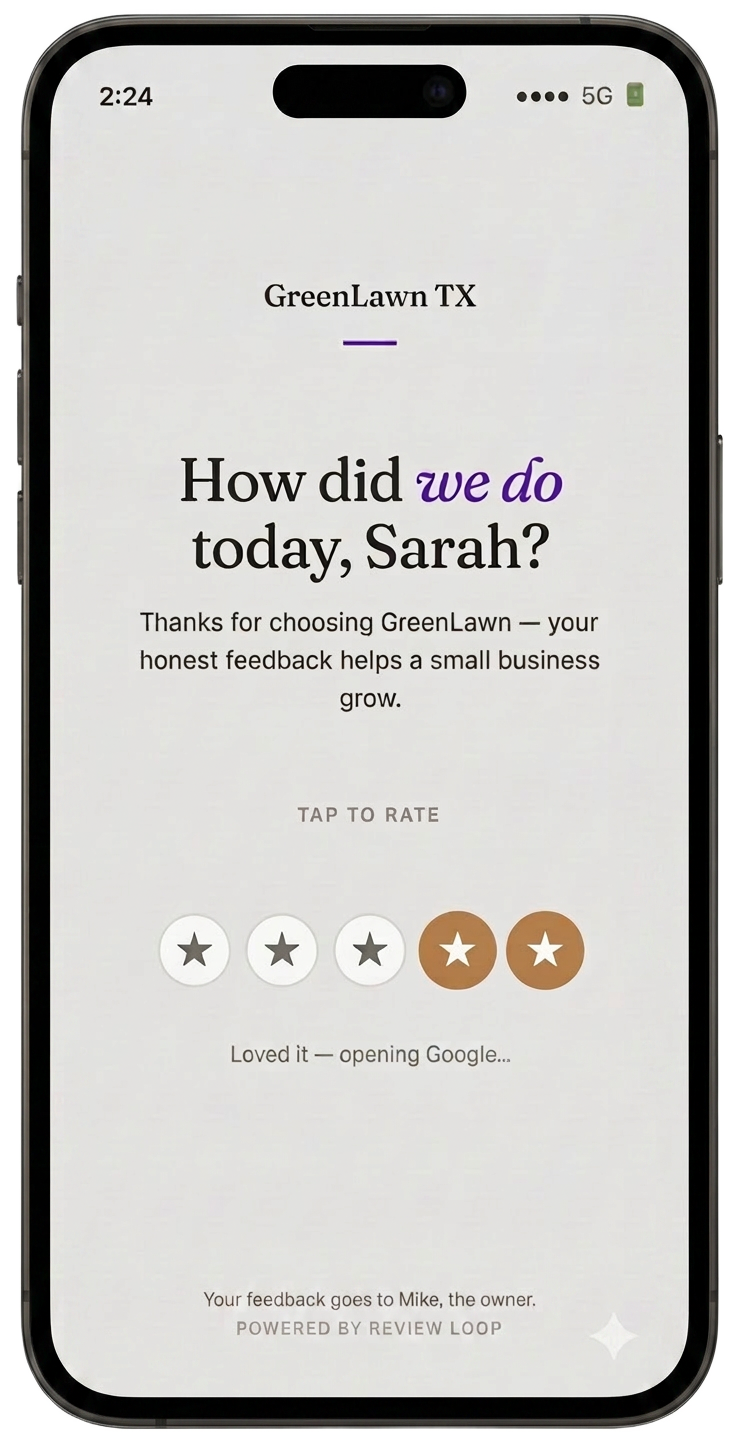
- 04What Sarah sees when she taps the link.
This is the one screen where the design has to stop feeling like Review Loop and start feeling like Mike's business. Sarah doesn't know — and shouldn't care — that there's a SaaS in the middle. As far as she's concerned, GreenLawn TX is asking how the service went. The page is intentionally sparse. One question, five tappable stars, no signup, no app prompt. Tapping a star routes her: 4 or 5 stars take her straight to Google's review form. 1, 2, or 3 stars take her to a private feedback form addressed to Mike personally. The "Powered by Review Loop" line at the bottom is small and quiet, both because it has to be (Sarah's experience comes first) and because it builds Mike's credibility — this is not a sketchy text message.
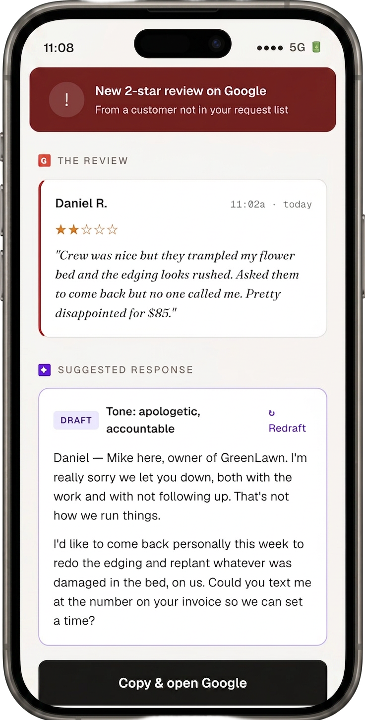
- 05The 2 a.m. screen.
This is the screen Mike actually pays for. A 2-star review just hit Google for a customer who never went through the request flow — the system caught it within 15 minutes via the GBP polling layer. The structure is deliberate: the review first, the response second. Mike has to read what Daniel actually said before he sees the AI draft. That's an ethical choice — we're not letting Mike reply on autopilot to a complaint he hasn't actually read. The draft is labeled as a draft. The tone is shown. The redraft button is right there if it doesn't feel right. Nothing posts automatically. The "Copy & open Google" button does exactly what it says — copies the response, deep-links into the Google review reply screen on Mike's phone.